As an undergraduate studying graphic design, I remember a professor in a crit saying that another student’s poster had “the look of meaning”. As students, we had our antennae out for snarky comments, but it turned out that this was meant as a compliment. We then used this phrase over and over. It somehow got to the heart of graphic design, whose reference theory is semiotics. Syntax is the look, semantics is the words, and pragmatics is the effect the design has – the actions that follow. Should the graphic designer strive to create form with an understated typography that stays out of the way of the meaning? Or is it OK to mess with and obscure the words in the service of an aesthetic goal? A previous blog in this series pointed out that designers run experiments.


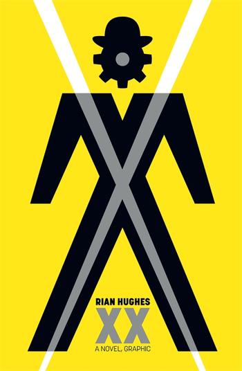
Experiments are performed in the novel XX in order to decipher an alien signal, what semioticians would call a supersign. Characters banter about semiotic weight. I interpreted this as the look of meaning. The protagonist defines it by example: “If you have a gearstick you can grind your gears. There’s a direct connection between form and function”.
Rian Hughes is a professional graphic designer as well as a writer, and his 992 page novel explodes typographically. Concrete poetry? Fluxus intermedia? Really, this is more like a push against the confines of the book medium in a way similar to another novel that both reflects on and uses design, The Familiar. The physical book version of XX is beautifully printed, but is at the limit of what you might want to carry around. The kindle digital version, however, doesn’t work as well: the typography calls for vector graphics or higher-res images. One can imagine engaging with this book inside VR when the headsets are good enough. In sum, we are confronted with an enormously fun print artifact that novelistically engages with many serious topics, a kind of design fiction.
Prominent is computational design. The signal, received from space, has a logic. The book’s pattern-sensitive protagonist concludes the signal wants to be embodied. Of course! In Peircean semiotics signs are realized through a process of interpretation that happens in minds. The interpretation process creates other signs. In the book, there is also a kind of Burroughs language-is-a-virus vibe: the signs want to reproduce, and minds are the vehicle.
How, though, to embody the signal? Experiments ensue. 3D printing is attempted. Musical computations are parameterized using the signal. The breakthrough comes when the signal (and the surrounding signal zeitgeist) is lured into a honey pot virtual reality.
It is in VR that ideas, no matter how whimsical or deep, can be translated into human-like entities. Weirdly, the ideas express themselves typographically, changing font size, boldness, rotation, and arrangement as analogs for emotional expressiveness.
What is useful about VR? From the book’s perspective, it provides a convention that allows for ideas to be personified. But there is more than that. It now seems quant that in 1972 NASA put a plaque on the Pioneer 10 spacecraft for discovery by aliens. What if some more ambitious species instead compressed itself into signals that could be decompressed on the other side? Embodiment stage one might be easiest in some kind of digital realm like the metaverse.
Game designers are working in this territory. When non-player actors learn inside the game, they no longer are brittle rule-followers that can be easily beaten. Instead, they become increasingly formidable adversaries.
In the novel, VR is far more than a game setting. It becomes a place for encounters with aliens. Such aliens, the book suggests, could be from outer space, or they could be homegrown, self-aware memes already propagating in our digital metaverse. As digital twins eventually affect the analog world, these aliens gain semiotic weight.